Logo Design | Brand IdentityMIND &
INSIGHTS
Mind & Insights
Logo & Visual Identity
A typography-led identity for a clinical psychology practice—designed without literal mental-health iconography, using restraint, proportion, and a calming teal palette to communicate trust and clarity.
❋ The BriefThe client came in with a clear point of view. She wanted to move away from a generic, PowerPoint-built logo and asked for an identity that felt calm, credible, and contemporary.
A teal palette was chosen intentionally for its association with balance and emotional ease, and the brief explicitly ruled out common visual tropes - no brains, faces, eyes, or symbolic icons.
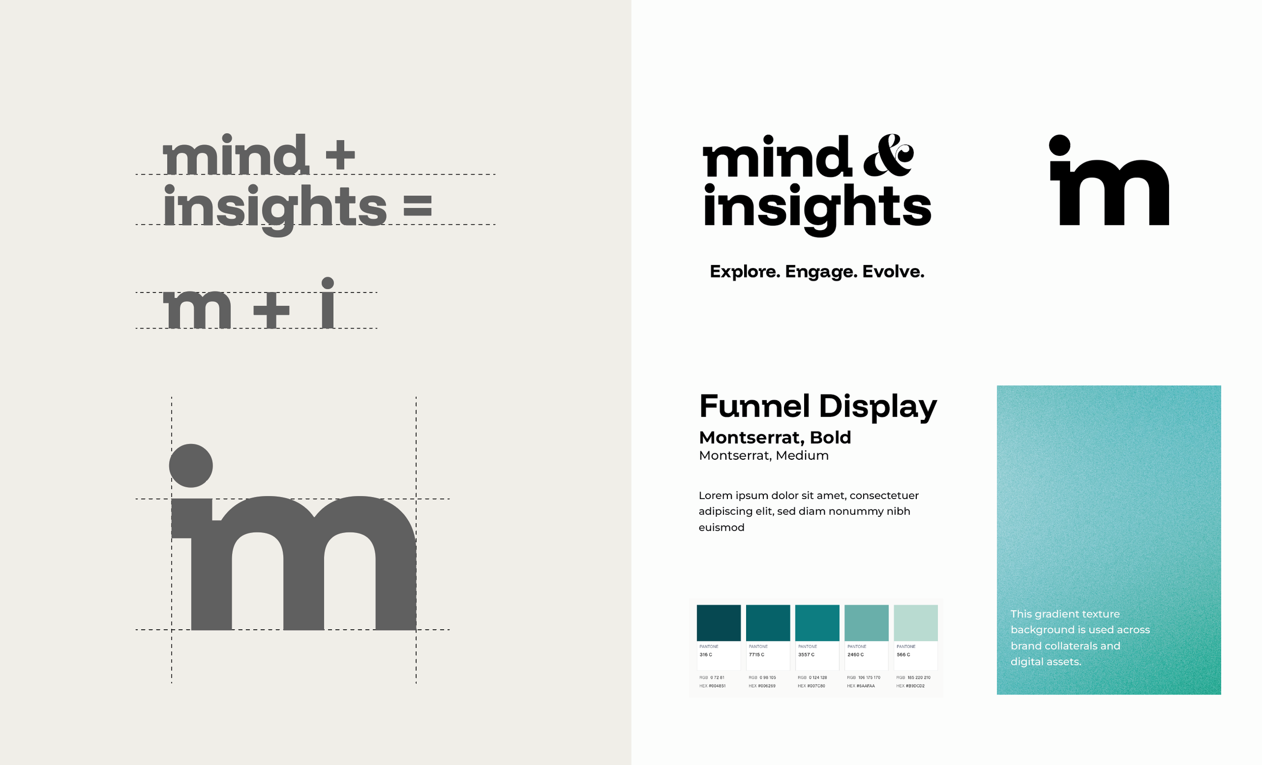
❋ Design DirectionThe identity was approached as a purely typographic system rather than an icon-led mark.
The goal was to communicate clarity and credibility through form, spacing, and restraint. A distinctive ampersand became the expressive anchor of the logo.
WHY A TYPOGRAPHIC
IDENTITY?
In mental-health branding, visual symbols often become interchangeable and emotionally prescriptive. For Mind & Insights, typography was used as the primary expressive tool - allowing the brand to feel composed, professional, and human without relying on literal representations of the mind.
This approach ensures longevity, flexibility across mediums, and a visual language that respects the intelligence and autonomy of the client’s audience.
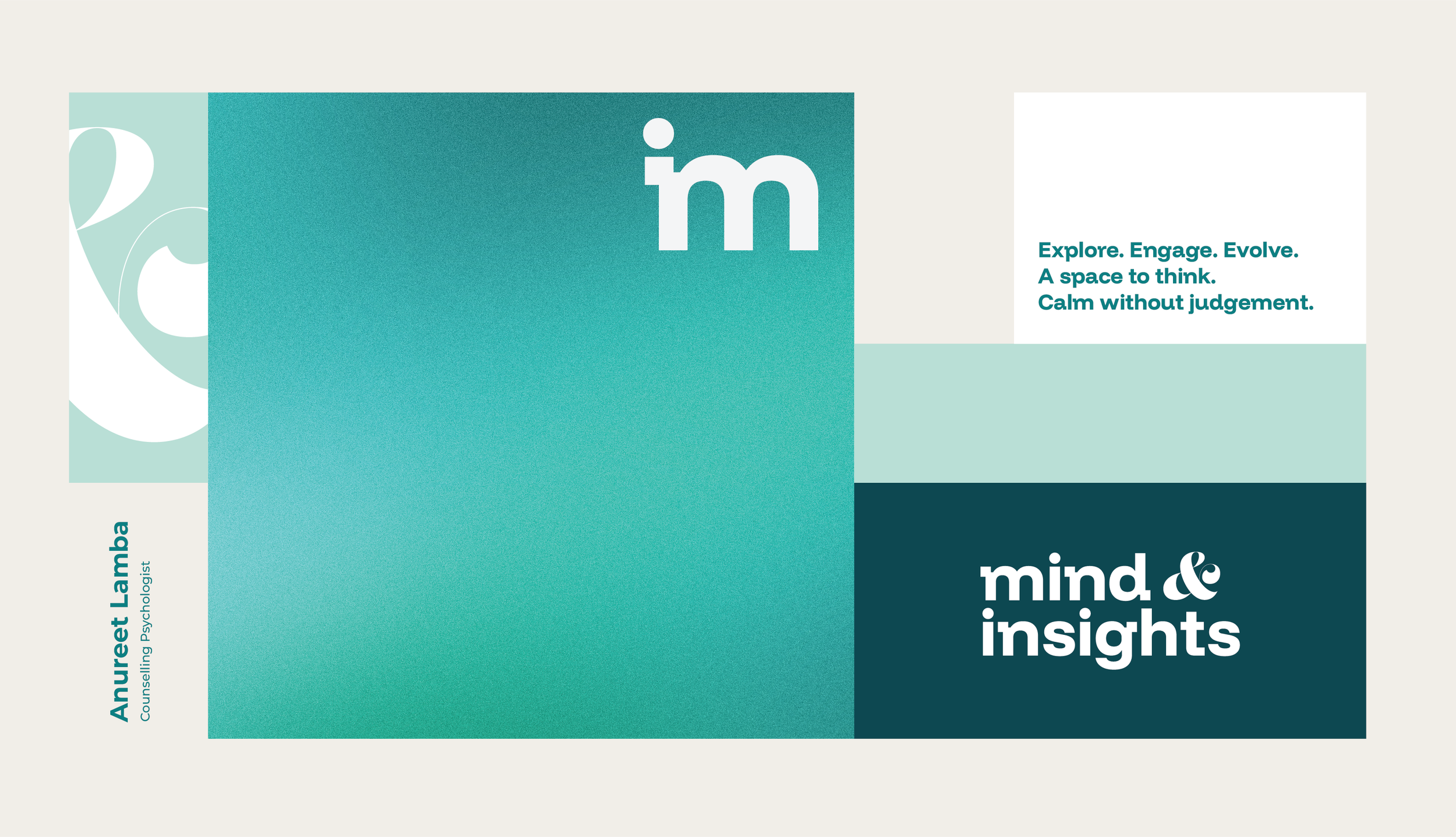
❋ A Flexible Brand SystemThe logo was designed to function with or without the brand tagline.
This allows adaptability across clinical, digital, and outreach applications. The system avoids trends, ensuring longevity and visual consistency.
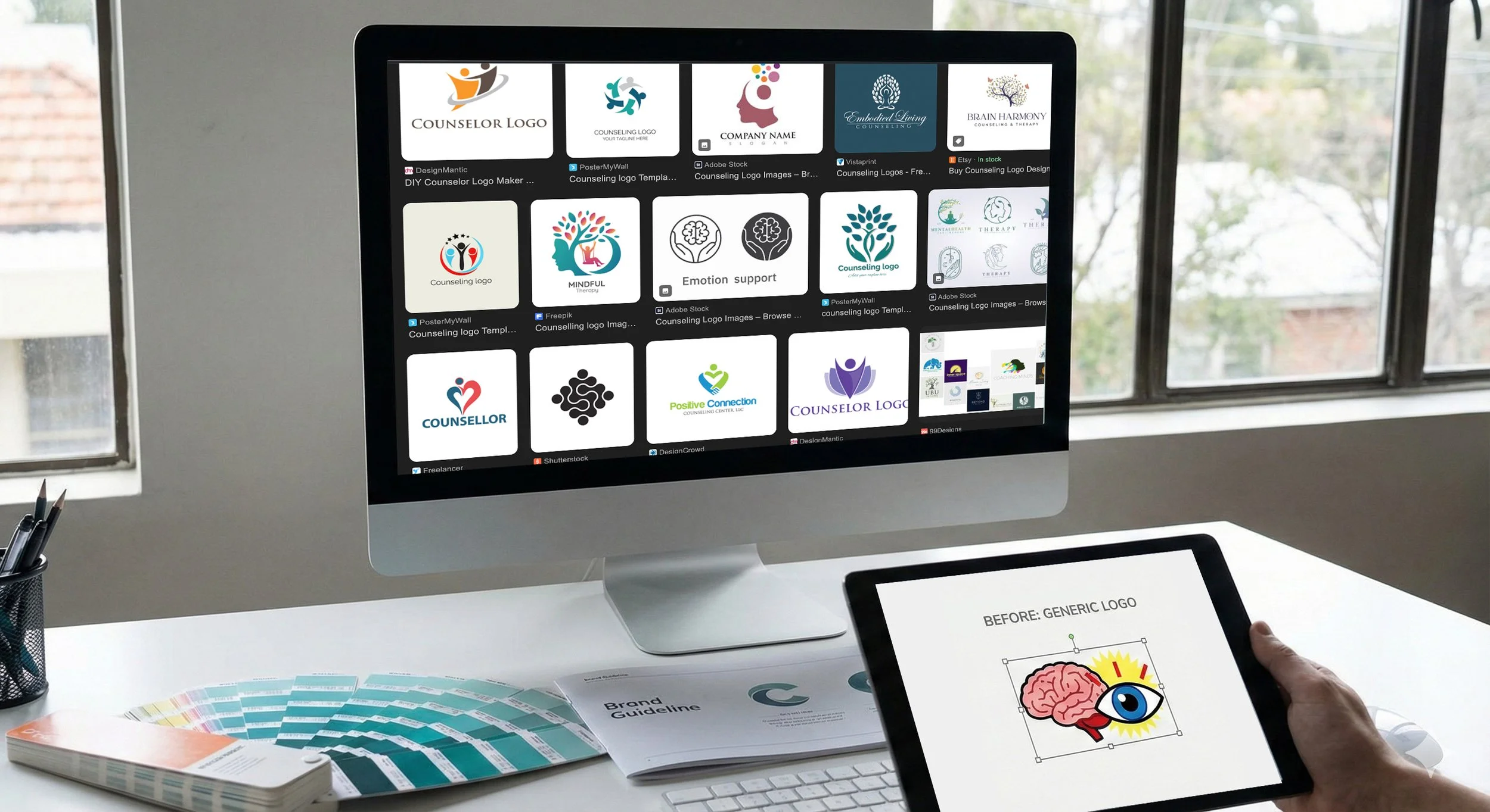
Ruling out common visual tropes - no brains, faces, eyes, or symbolic icons.