
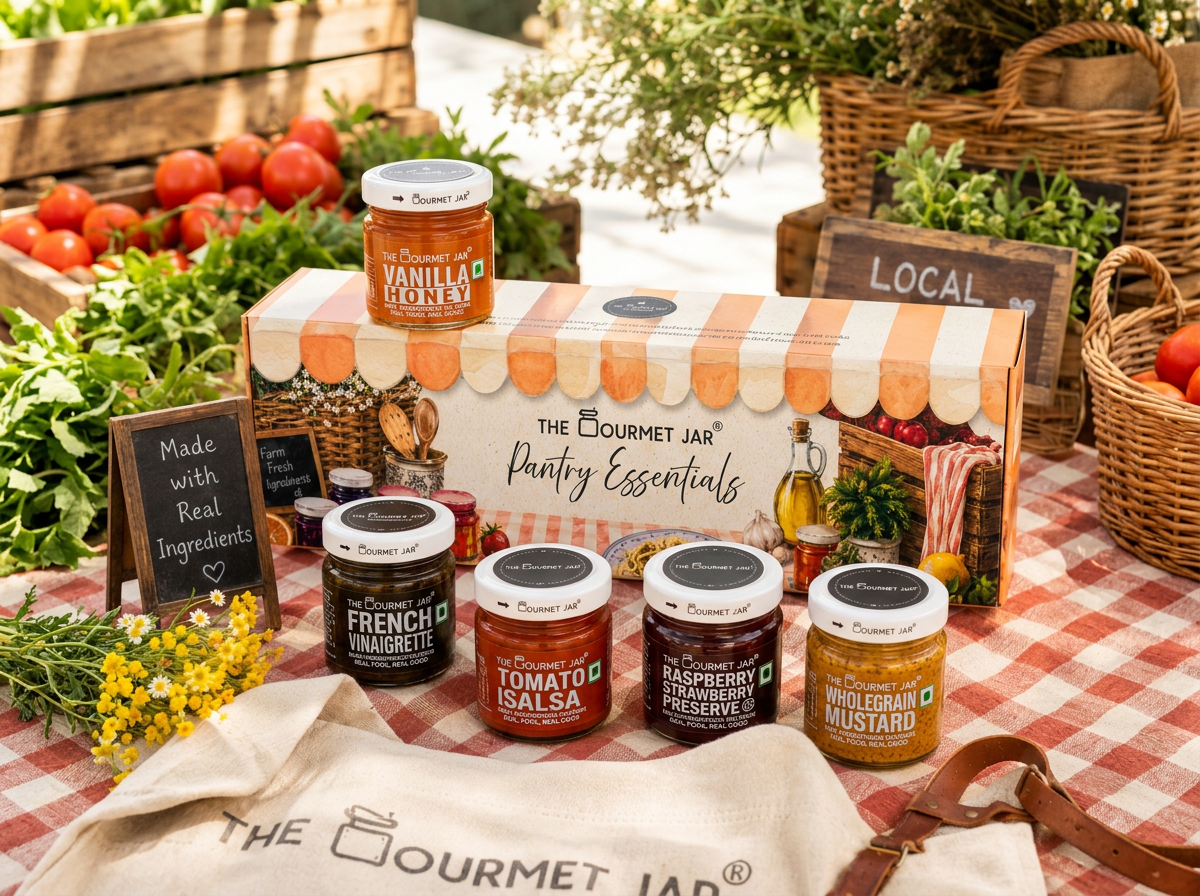
Packaging RefreshTHE GOURMET JAR
The Gourmet Jar
Packaging Refresh for Gift Boxes
A packaging refresh for The Gourmet Jar's gifting range, designed to make their small-batch condiments feel as good to give as they are to eat.
The new system introduces a farmer's-market visual world.
❋ The BriefThe Gourmet Jar's original gift packaging didn't reflect the quality of what was inside. A promise of quality ingredients and honest recipes.
The brand needed boxes that felt considered and gift-worthy — something a customer would be proud to hand over, not just a functional carton holding jars. The new design had to work across two SKUs (a 5-jar and a 10-jar set), stay true to the brand's "real good ingredients" promise, and hold up next to premium gifting brands on the shelf.
❋ Design DirectionThe concept was built around the idea of a farmer's market — the feeling of picking out fresh, honest ingredients straight from the source.
Watercolour illustrations of the produce inside each jar (tomatoes, mustard seed, berries) ground the packaging in that same promise of real ingredients the labels already carry through cleanly.
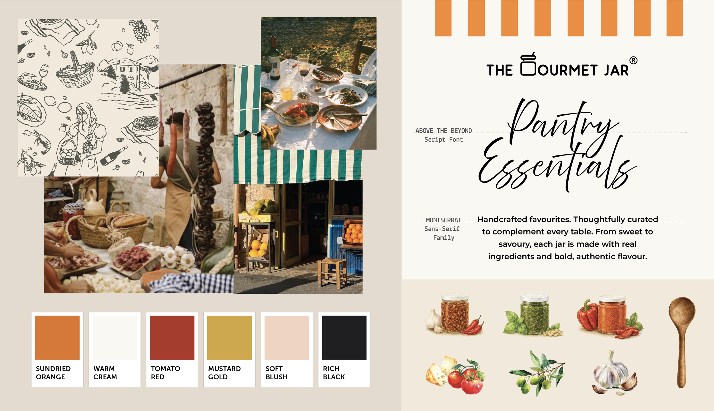
the hum of a Sunday morning market —
that's the world this packaging lives in.
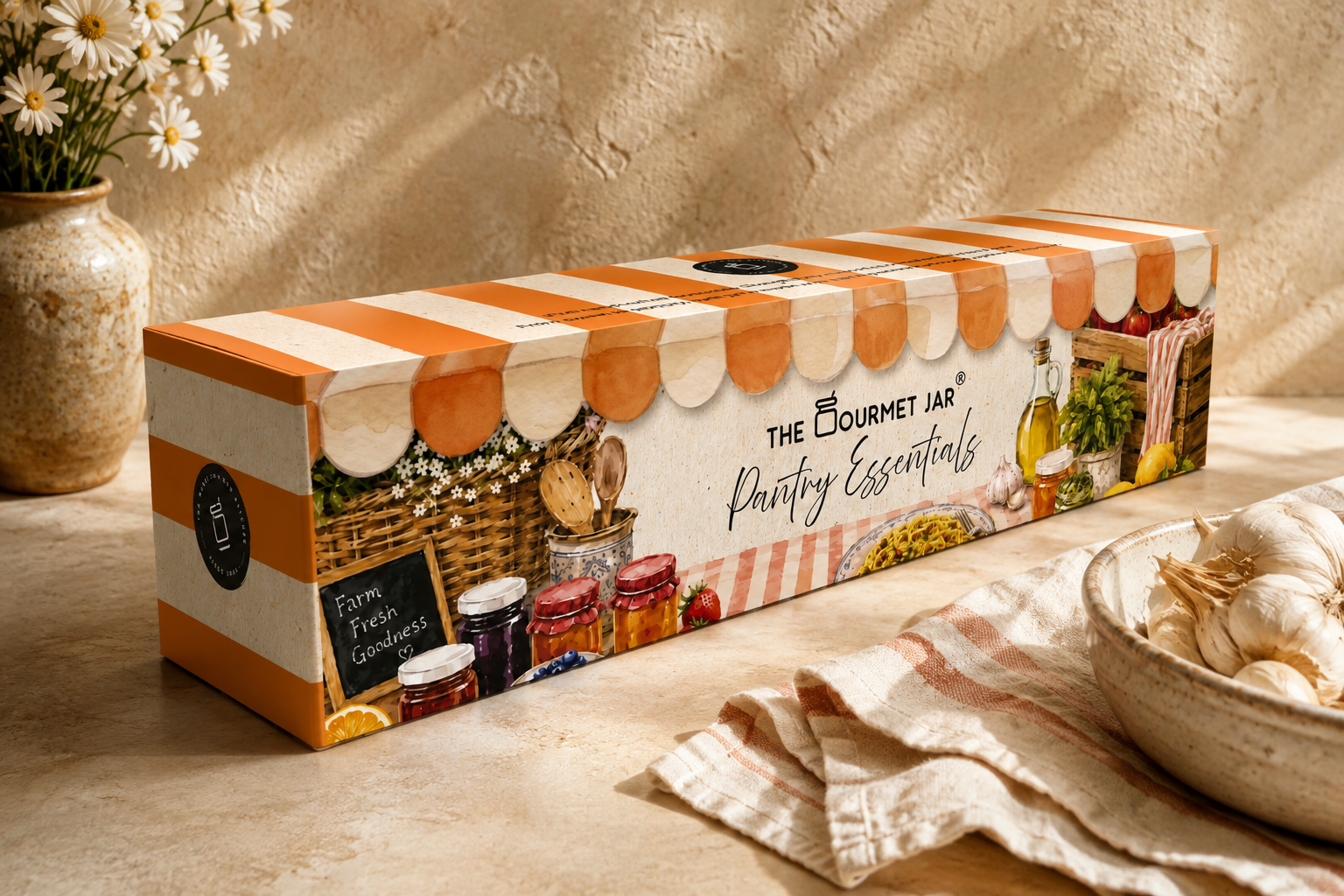
❋ Thoughtful elements throughout the boxesA striped market awning motif runs along the box edges, translating that farm-stall feeling into a simple, repeatable graphic element.
A warm, handwritten script for "Pantry Essentials" adds a personal, gift-note quality against the structure of the bold sans-serif logotype — playing restraint against warmth, rather than defaulting to either extreme.
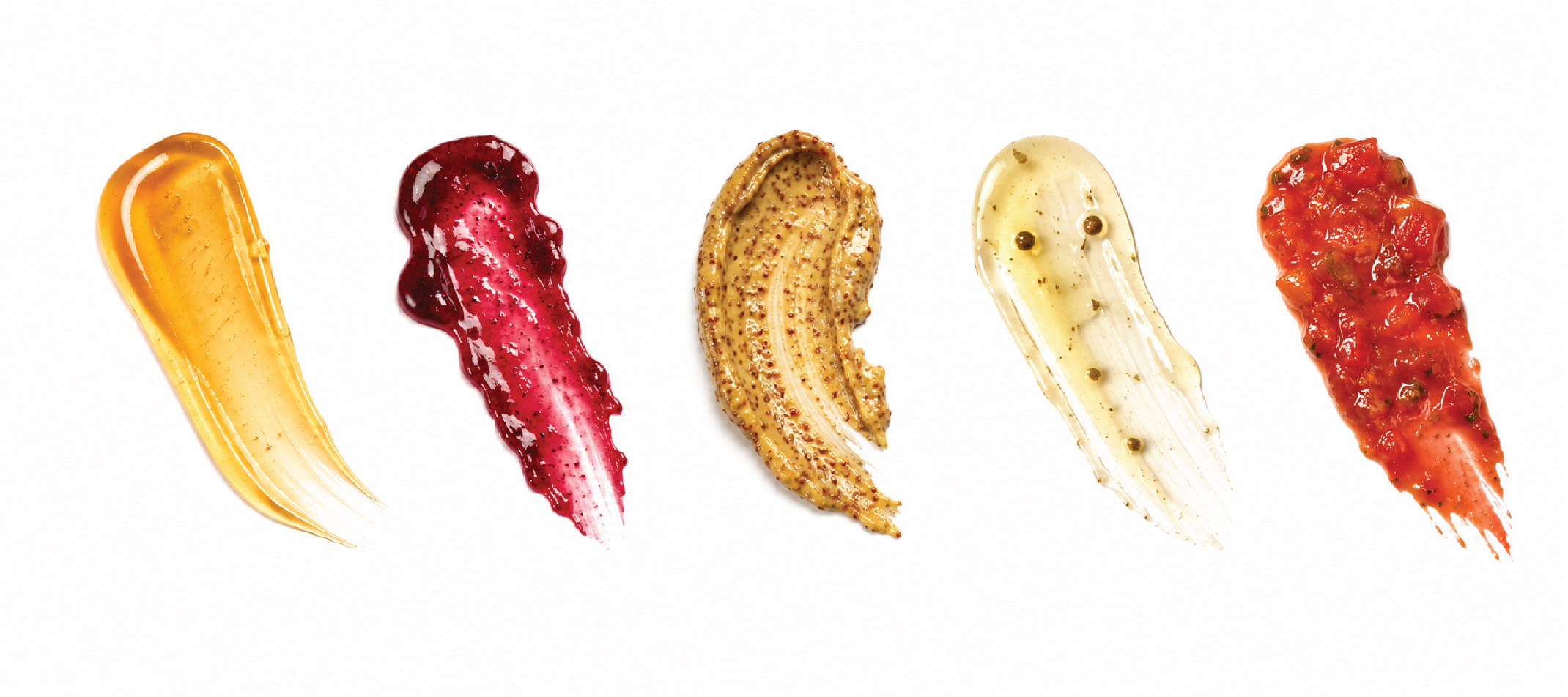
flavour swatchES, letting texture and colour do the talking before a single word is read.
It's a small detail that turns an ingredient list into something closer to a paint chip card — playful, tactile, and true to what's actually in the jar.