
BrandingCOMMONSTABLE
Commons Table
Branding for an Indian Pickle, Made for a Global Table
A concept branding system for Commons Table, reimagining the Indian pickle — a deeply regional, everyday staple — for a global audience.
❋ The BriefAchaar is one of India's most beloved condiments, but its packaging has rarely traveled beyond the domestic market — often loud, ornate, or purely functional.
Commons Table needed an identity that could sit confidently next to specialty foods from anywhere in the world, without losing what makes the product Indian in the first place. The challenge was translation, not dilution: keep the spice, the heritage, and the hand-pickled character, while speaking a more international design language.
❋ Design DirectionThe name "Commons Table" set the tone — the idea of a table shared across cultures, where a jar of Indian pickle sits as naturally as any other condiment.
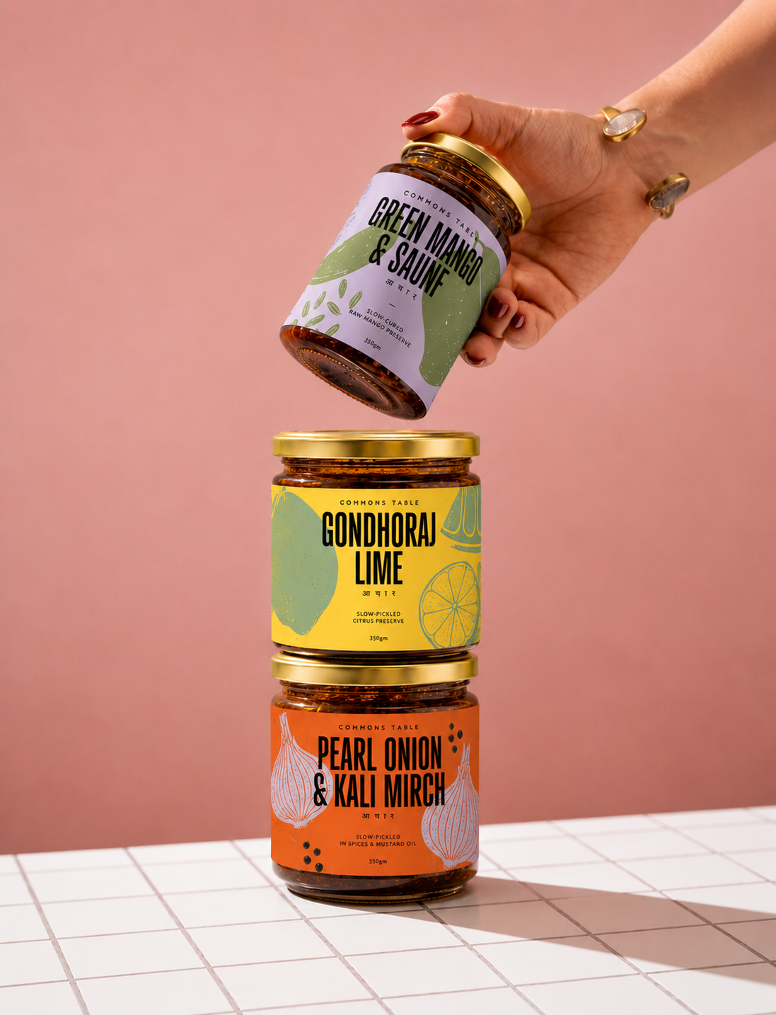
Bold, saturated backdrops (olive, blush pink) replace the traditional red-and-yellow palette often associated with pickle packaging, giving each variant its own distinct mood while staying part of one family.
The label itself stays clean and typographic — a restrained wordmark, the variant name given the most visual weight, and a single line of Devanagari script ("आचार") kept intentionally, not decoratively — a quiet signal of origin rather than a costume of "Indianness."
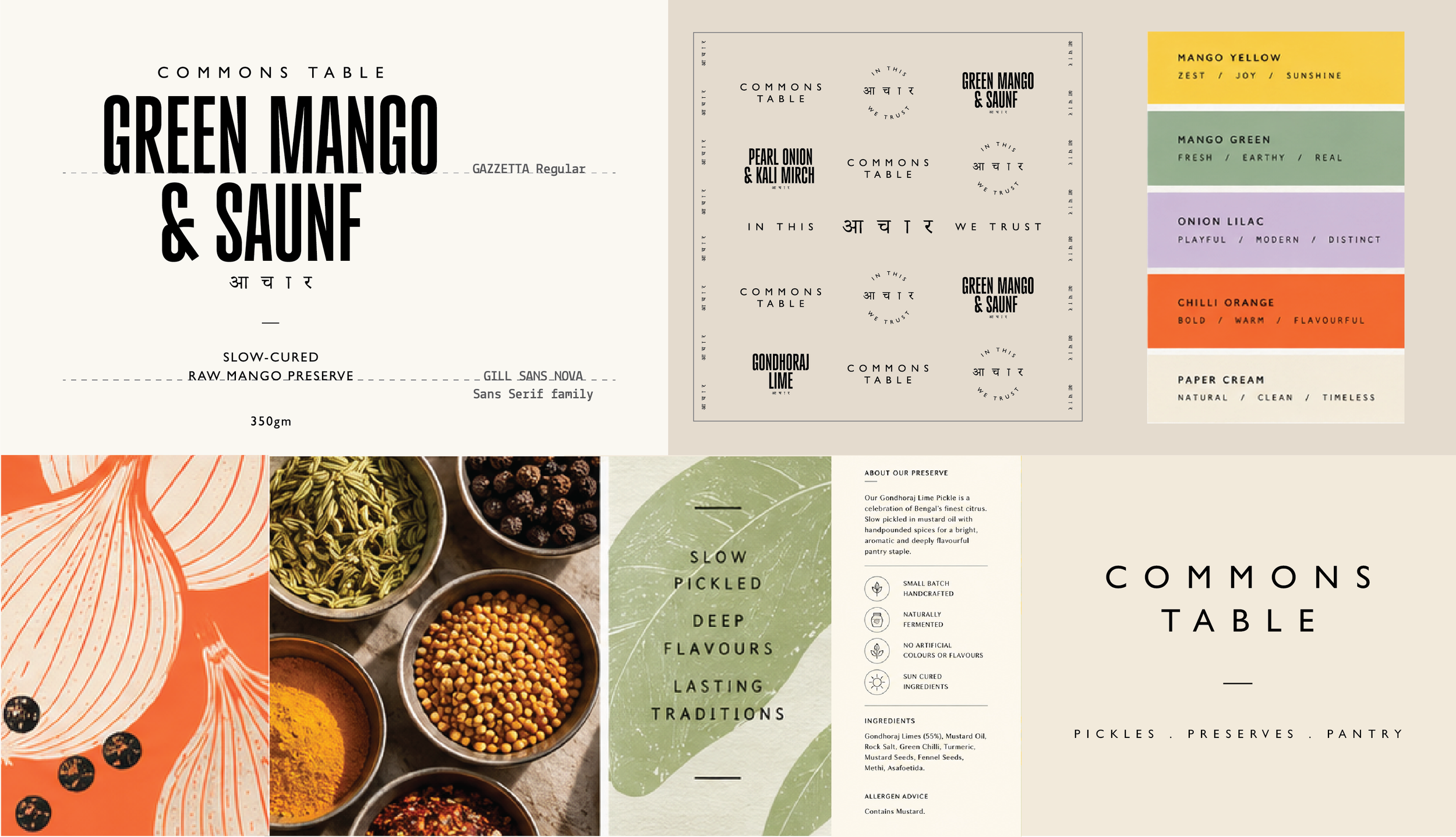
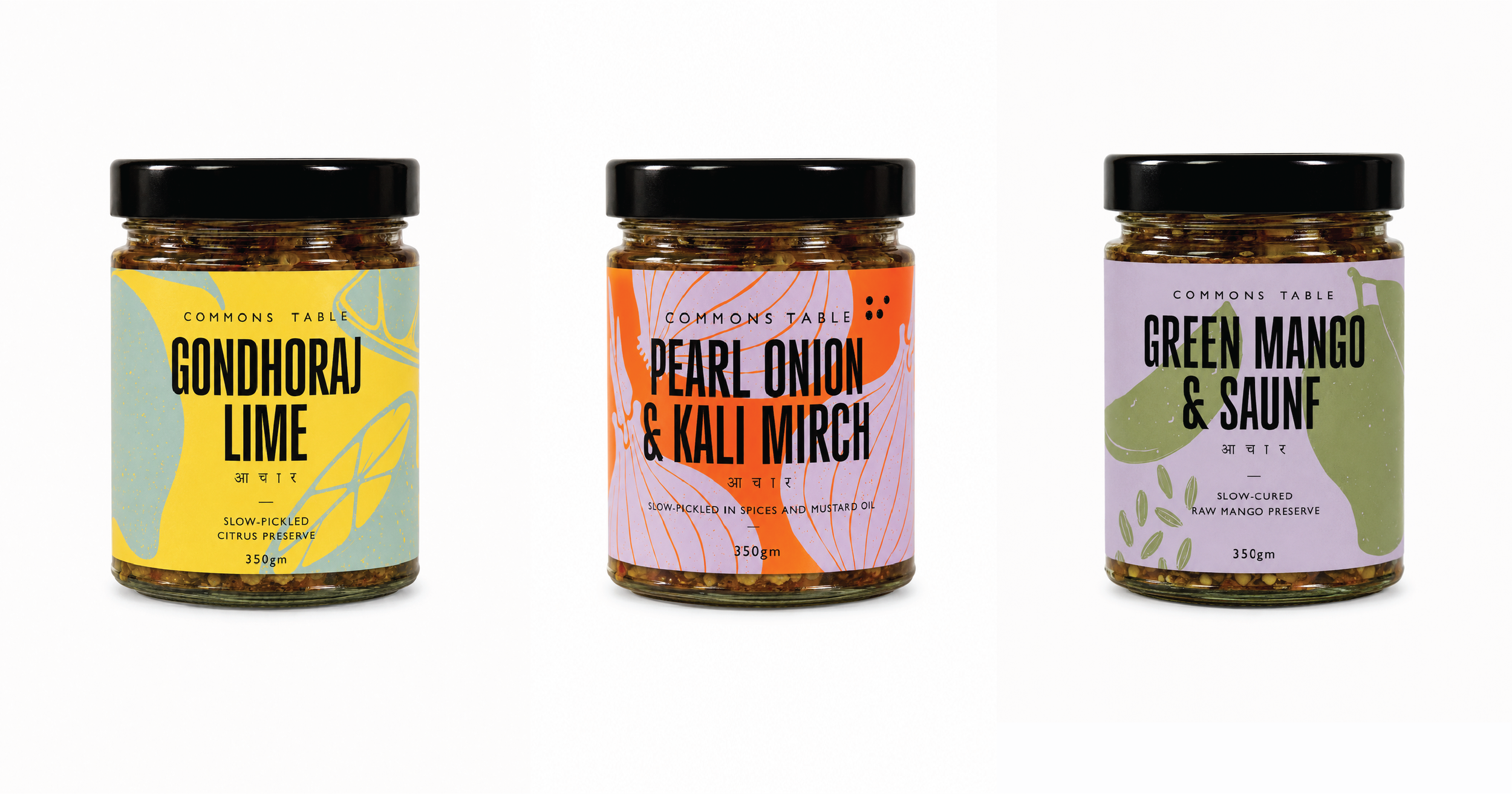
A single line of Devanagari script "आ चा र" kept intentionally, not decoratively.
A quiet signal of origin rather than a costume of "Indianess."
LOCAL FLAVOUR, GLOBAL FLUENCY.
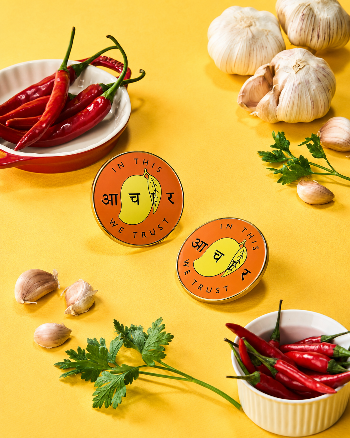
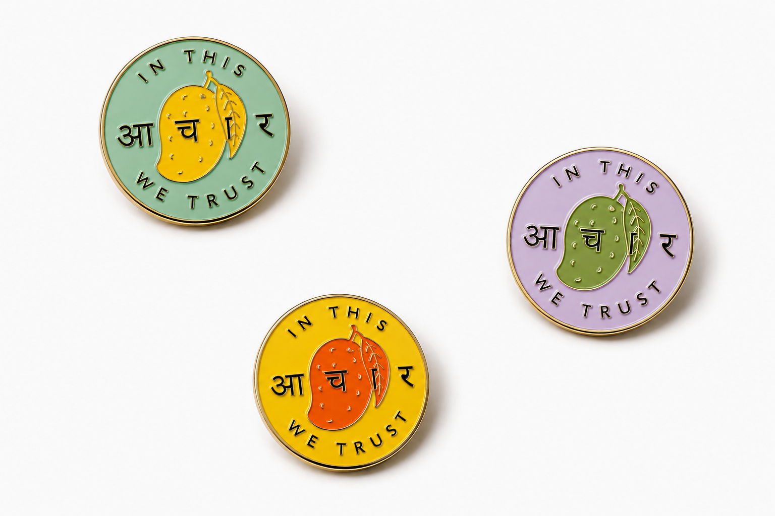
Cheeky, not chaotic. Proud, not performative.
The tone is warm, a little playful, never precious about tradition — closer to a knowing wink than a lecture on heritage. "In this आचार we trust" plays on the familiar "In God We Trust" line, a small joke that only works if you already know what achaar means to people who grew up with it — while still being legible and charming to someone encountering it for the first time.